
Course project in UI for UX Designers at Career Foundry.
2 months, May - June 2022
UI Designer
Pen & Paper, Figma, Illustrator
UCD
Looking for properties can sure be a clutter of information when entering real estate pages, especially when you’re new.
So what if there was an app that just did what it was intended to do without all the extra? An app that would make new buyers such as Rashida or old ones encouraged to find properties without the overwhelming feeling of a complicated process.
A web responsive real estate app for especially first-time buyers to find and invest in suitable properties based on their profile.
I started this project with a brief where I was provided with the objective, context, 5 why's, and a user persona. Design criteria had also been made with user stories and feature requirements.


“I want to provide my family with financial security. I’ve been considering buying property for a while, and am looking for a tool that can help me find what I’m looking for, quickly!”
Rashida
I started with a quick competitor analysis to find strengths, weaknesses, opportunities, and threats with similar sites. But also to get a good sense of familiar design patterns.

I took the already known user stories and outlined the key functionality. From these, I created user flows to make sure all task flows were covered.

1. As a user, I want to create a profile containing all my property criteria, so that I am recommended results most relevant to me.
2. As a user, I want to be able to search and filter properties, so that I can find good matches based on my needs.
3. As a user, I want to be able to save or mark properties I am interested in so that I can easily revisit them.
4. As a user, I want to be able to contact the right people if I am interested in scheduling a viewing.
I started with ideating quick sketches on pen and paper and moved on to digitize these with prototyping to test the form and functionality of my user flows. I made alterations after conducting guerilla testing.
Some of the improvements after testing:


These were chosen after scanning for keywords and associations found in user stories and user persona.
The users are looking for
stability for themselves and their families. Most of them are first-time buyers.
Our users are modern busy people on the go who needs to quickly access suitable properties on the go regardless of location.
I created two distinct mood boards from the above keywords to determine better which aligned with the project brief and knowledge of the user best.
Why? - The colors were more vivid. Additionally, it communicated Stability, Growth, and Availability better than the other.
Rather, the brief aligned more with #1 and Rashida, a first-time buyer with family and kids who likes to be out in nature while investing in safety for her youngsters.
The muted analog colors used in #1 conveyed growth, nature, relaxation, and reliability. Additionally, the rounded corners made it easier on the eyes. They include icons, buttons, and illustrations

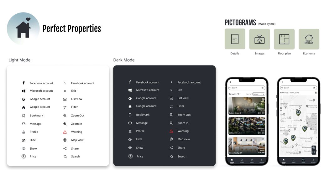
This is one of the parts I love the most. I get a good chance to make sure all elements align and speak the same visual language throughout the app.

I wanted to create an atmosphere of inviting calmness, and trust mixed with growth and stability. How could I find a balance between contrast and harmony with the analogous hues of green and blue while designing for color blind and staying with my mood board?
I played around with different palletes and decided on the following which was the best fit with the mood board, atmosphere, and contrast in mind. I also tested it with the most common types of color blindness to ensure contrast.


Fjalla One is a sans-serif which works good for larger semibold headings that breathes. I’ve chosen Noto sans for smaller headings and body text since it’s a good readable text that harmonises well with Fjalla One.

I'm passionate about illustrations and created these vector images. It was important to align these to the brand colors and make them consistent. I wanted them to be clean and in the spirit of diversity and inclusion.

Familiar gesture patterns used within the app, mimicin the real world.

Animations were used to guide users attention.

Confirmation success with an arrow jumping up and down
used as onboarding to find the location of inbox for new users.
I took a mobile-first design approach to then scale up to both tablet and desktop, deciding on where the design will adapt for different sizes. Bottom bar navigation will adapt to top bar navigation on desktop for example.

Mobile (414px)


Tablet (834px)


Desktop (1440px)


I was able to dig deeper into the aspects of UI from a UX perspective during this project. I learned even more about accessibility and vision impairment which is a huge interesting challenge. I also learned more about UI animation which is a skill I aim to become better at.
The next step would be to run more user tests with real potential property buyers to gain more feedback for further improvements. A 360o view would be nice to implement to give a good representation of the neighborhood.
Icons
Images
Illustrations